

Accessible Text Design @Insomniac Games
This was an industry-sponsored research project that I worked on at Georgia Tech with another graduate student. The central focus of this project was to evaluate current gaming accessibility standards and provide documentation for game developers.
Research Methods: Literature Review, Competitive Analysis, Semi-structured interview(s), Surveys, Affinity Diagramming, Experimental Study, Quantitative Data Analysis
Tools: Figma, Miro, Otter.ai, Zoom
My Role(s): UX Researcher, UX Writer
Dates: January - April 2022
Partner: Theresa Hsieh
The Problem
The presentation of the text in console video games is an important aspect of game design that contributes to a sense of immersion within the game world and overall usability and accessibility. Game developers are often faced with trade-offs when it comes to designing text and may sacrifice usability to achieve the desired art style.
A challenge specific to console video games is the disconnect between the development environment and the environment in which the games are actually being played. Developers often design console video games at desks in front of monitors, then evaluate their design through rules of thumb like the 10-foot UI Principle. This is purely a judgment call and is not grounded in how much a game UI adheres to established accessibility standards.
With the above information in mind, we set out to respond to the following problem statement:
How can we develop a set of best practices or standards that developers can use to create usable and accessible experiences for console gamers with a wide range of visual abilities?
Project Timeline

The Solution
A comprehensive set of standards and guidelines.


An experimental framework for evaluating game accessibility standards in context.


Background Research
Background Research
The two main goals of our background research were:
Identify limitations of current gaming accessibility standards regarding text
Identify research gaps in current mainstream game accessibility
Literature Review
Our literature review consisted of current game accessibility standards, game developers conference (GDC) talks, and articles (academic and online).


Key Takeaways


User Research
Impact — By taking a user-centered, inclusive approach during this stage of the project, we were able to capture important information about end users of varying visual abilities.
Interviews
We conducted interviews with industry professionals and gamers to explore the cause-and-effect relationship between decisions made during the game design process and the subjective experiences of those playing the games.
Industry Interviews
We interviewed 3 individuals currently working at AAA gaming studios. The goal of these interviews was to gain insight into the following questions:
What trade-offs are made when designing text for console video games?
What steps along the design process is text accessibility/usability considered?
What does the evaluation process look like for game accessibility/usability?
Findings
We synthesized findings from these interviews through affinity mapping to generate insights about our target users.

Our findings revealed 3 important insights regarding design trade-offs and advancing accessibility in game design practice:
Promoting empathy for gamers with disabilities is an important first step in improving accessibility practices across an organization
Accessibility and usability are 2/6 main goals of game UI that must be considered iteratively throughout the research and design process
Accessibility guidelines are a good starting point for developing UI, but they are not a means to an end
Player Interviews
We interviewed 6 gamers to understand their subjective opinions on game accessibility and the role that text plays in their gaming experience. Of the 6 gamers we interviewed, 3 identified as blind-visually impaired (BVI).
We specifically wanted to understand the following:
How does the presentation of text affect a game’s usability and accessibility?
How do players compensate for poor text design?
How do players feel about the current ways games present text?
What environmental factors impact gamers’ comprehension of text?
Findings
We synthesized findings for both subsets of gamers through affinity mapping, then generated key insights shared between both groups.


Text is an important contributor to feelings of escapism and relaxation when playing a game
Gamers have experienced many different issues with in-game text, and these issues break immersion by leading to frustration or uncertainty
Gamers will abandon games if text issues present too much of a challenge
Personas & Storyboards
We developed 3 personas and storyboards to contextualize our interview data and promote empathy toward gamers who have experienced poor text design. Specifically, these deliverables highlighted the differences in gamers’ feelings toward text design and the ways in which they respond to issues.


Survey
Alongside our interviews, we created and deployed a survey to 48 gamers. The main goal of this survey was to contextualize the environmental factors of gamers’ console setups.

One group of gamers reported playing console games on screens less than 32 inches, sitting closer than 5 feet from the screen.

One group of gamers reported playing console games on screens greater than 50 inches, sitting farther than 5 feet from the screen.
Experiment
Impact — Our experiment provided a methodological framework for evaluating accessibility standards in context. Results from this also emphasize the necessity of continue evaluation of the minimum text size standard, as well as other standards.
Experimental Design
Inspiration
Information gathered during the project's first two phases revealed and reinforced 3 key insights regarding text design in console video games that informed the focus of our experiment.
There is little to no research evaluating/validating current accessibility guidelines used in mainstream console video games (Background Research, Industry Interviews)
Text size is a common accessibility barrier for gamers with and without visual impairments (Background Research, Gamer Interviews)
Evaluation of console video game UI lacks adequate consideration of the environmental context in which games are being played (Industry Interviews)
Objectives
With the above insights in mind, we decided to design a two-part experiment evaluating the minimum text size standard in a simulated console gaming environment. Specifically, we chose to prioritize those sitting far away and playing on a large screen since we determined this to be more unique to the console gaming experience.
Through the experiment, we hoped to answer the following research questions:
What is the optimal text size for console video games? (Current standards vary from 26px to 28px)
Are there clear diminishing returns for text size in console video games?
What is the relationship between text size and distance from the screen?
Procedure
We recruited 22 participants (7F, 15M), mostly in the 18-34 age range. Of these participants, 71% required some form of vision correction and 29% did not. Those requiring visual correction were wearing it at the time of testing.
Prototype
We developed an interactive prototype to support both parts of our experiment. To simulate the console gaming experience, the prototype was navigable via a Nintendo Switch controller, displayed on a 65-inch 4K TV, and modeled after a popular “card-style” interface well-suited to accommodate multiple reading trials.


Part I — Text Comprehension & Readability
Five different sets of 5 cards at varying pixel heights (22, 24, 26, 28, 30px) were displayed on the TV. Each card included an image followed by a Chapman-Cook-inspired text excerpt containing a single contextual error. We asked participants to read each card and identify the contextual error(s).

Example of our prototype from part I. In this example, the word bottom is the error that needed to be identified by participants.
-
We quantified reading comprehension as the time taken to flip over the card (pressing the ‘A’ button on the switch controller) and verbalize the contextual error
When participants completed a set of cards, we asked them to rate the readability of each set of cards on a 10-point QUIS Likert Scale (0 = hard to read, 9 = easy to read)
We presented the cards in random order for each participant to control for order effects
Part II — Optimal Size & Distance
Our prototype accommodated a single card displayed on the TV with one text size. The size on the card could be changed dynamically with the controller joystick to 1 of the 5 previous values.

Example of our prototype from part II. In this example, the card displayed is at 22 px — the smallest of the 5 sizes.
-
For the first activity, we asked participants to select the card that is most optimal for their viewing experience and then explain why they made this selection.
For the second activity, we asked participants to move their chairs to the most optimal distance for 22, 26, and 30px sizes and then took measurements.
Results
We gathered both qualitative and quantitative data during both parts of our experiment.
Part I
Subjective ratings of text readability increased as the size of the text displayed on the cards increased.
Significant difference in text readability from 22px to 28px, and 22px to 30 px (Wilcoxon signed-rank tests + Bonferroni’s correction)
No significant changes were observed in reading comprehension with increasing and/or decreasing text size.
Lack of significance confirmed through Wilcoxon signed-rank tests
Changes in text size can lead to perceived changes in other text features.
Increases in size led to perceived increases in word count and line spacing, as well as decreases in white space
Decreases in size led to perceived decreases in font weight and line spacing, as well as increases in white space
Part II

The average seating distances at each text size were significantly different from each other (Repeated-measures ANOVA).

Votes that each participant gave for their optimal text size at 10 feet away from the screen revealed a tie between 26 px and 28 px.


Standards Creation
Impact(s) — Sharing this information through our standards can spread greater awareness of the importance of accessibility in the game design process. Previously, accessibility standards and tools were spread across different organizations or online resources. We compiled, reformatted, and created new standards in a single form of documentation, which could greatly improve the efficiency with which game developers can evaluate the accessibility of their games.
Creation
We took the information gathered from our background research, user research, and experiment to construct a set of standards for game developers. Our main goal was to package all of the information we had gathered and present it such that it could be more easily understood and accepted by the game designer/developer community.
Standards Content

UX Writing
Visual Design


Evaluation
Design Critique Activity
To inform the initial draft of our standards, we conducted a design critique activity with 12 UX/HCI specialists. The main goal of this activity was to present existing sets of accessibility standards/heuristics and get subjective feedback on their written and visual presentation of information.

Some examples of feedback we got from this activity that directly influenced the design of our standards:
“I wish the guidelines were less text-heavy and included images and tutorials.” [Game Accessibility Guidelines]
“I wish there were examples of the right and wrong ways of implementing certain standards.” [Xbox Accessibility Guidelines]
“Good use of color and space makes it easy to see each section — not looking at just a wall of text.” [Nielson Norman Design Heuristics]
Expert Evaluation
We created an initial draft of our standards and conducted 3 separate evaluation sessions with 5 experts to generate feedback on the written/visual content and their potential fit within current game design practices. A summary of the feedback we gathered is listed below:
“I could see developers using this, especially new developers”
Having different formats (e.g. ppt, pdf, executive summary) would improve shareability
Include — and highlight — tips/links to resources and accessibility tools
Adding additional information to the appendices would be helpful for researchers or developers wanting a bit more information
Final Draft
We implemented the feedback from our expert evaluations and created the final draft of our standards. A link to them can be found here.
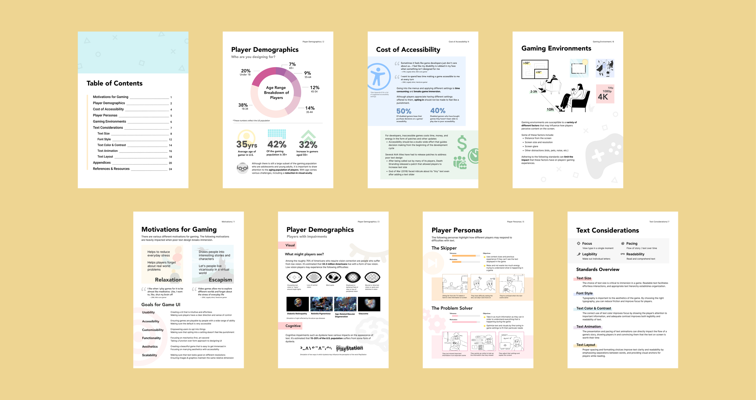
Providing Context
The first 6 pages of our standards are dedicated to creating empathy and context. We wanted a clear and concise way to show game developers who they are designing for, and in turn, advocate for greater consideration of accessibility in the development process.


Text Guidelines & Considerations
The body of our standards consists primarily of a compilation of guidelines for several important text considerations.

Top-level headlines
Each text characteristic has a top-level headline that explains its importance, and the impact it can have on the “effortlessness” of text in a game.

Relevant subsections
Within a particular text characteristic, we include subsections that include information/guidelines for related text features (e.g. high contrast backgrounds in the text color and contrast section).

Examples in practice
At the end of each text characteristic section, we include good and bad examples of guidelines being followed — or not — in the real world.

Impact of implementation
Below the headline is a section explaining how good and bad implementations of a text feature impact gamers — supported by quotes from our interviewees.

Guidelines + Graphics
For each text characteristic, we include a bulleted list of guidelines plus corresponding graphics.

Links to tools
We include links to online tools that can be used by developers to quickly check the accessibility of their game (e.g color contrast, color deficiency support).

Evaluation Procedures
In addition to tool links, we include subsections describing specific evaluation procedures developers can use to evaluate the text they have designed (e.g. checking text size)
Appendices
At the end of our standards, we included 4 appendices that provide additional detail and auxiliary information about our experiment, common accessibility settings, accurately determining pixel height of on-screen text, and subtitle/caption guidelines.


Multiple Formats
We created 3 other formats of our standards in addition to our original PDF format.

Slideshow (Guidelines)
We reformatted our standards and guidelines into a slideshow to provide game developers with a different sharable format of our standards. Some developers may prefer smaller chunks of the information displayed on slides, rather than combined in a pdf document.

Slideshow (User Advocacy)
We created a separate slideshow containing the information that we gathered from our background/user research. This slideshow can be shared with studio-wide audiences — in addition to game developers — to promote the importance of accessibility in the game development process.

Executive Summary PDF
We created a separate pdf document without the added visuals and industry examples. More experienced developers could use this as a checklist they could easily scan and access throughout development.
Next Steps + Recommendations
Our experimental methodology could be expanded and iterated on in a number of ways to gain a deeper understanding of the optimal text size(s), or explore other text considerations identified in our standards.
Due to time and sample constraints, we were unable to recruit BVI participants for our experiment. To develop a more comprehensive understanding of accessibility standards, future work should strive to include a more inclusive sample of gamers.
We hope that our standards are shared and discussed amongst employees at Insomniac or even beyond. Doing so could help further advocate for accessibility considerations and lead to more enjoyable gaming experiences for players of all visual abilities.
Reflection
A unique approach to human-centered design
One thing I enjoyed most about this project was that it provided an opportunity to take a different approach to the human-centered design process. Translating insights from user research (surveys and interviews) and turning them into a rigorous experiment was a unique experience that I wouldn’t have anticipated. However, it showed how the human-centered design process could take different forms as long as the end user is the focal point.
Learning the nuances of UX in a new industry
This was my first time being exposed to UX in the gaming industry. I learned there are nuances to UX processes and perspectives in the gaming industry compared to other fields we had explored in projects. The gaming industry is focused on entertainment, and because of that, there are different objectives you must consider as a researcher/designer to inform the design of gaming experiences.
Self-driven success
Unlike previous UX projects I have worked on during graduate school, this project was almost entirely self-driven and organized. As a team, we had to develop our own roadmap for completing a successful project. This required an additional level of time and project management skills in order to work within the time constraints of a school semester.